Showing posts with label illustration. Show all posts

Wednesday, October 1, 2014

Baseball Postseason Time!

None of the teams I root for, Red Sox, Phillies, Yankees nor Mets, made it to the postseason. Yes, you read that correctly, I believe in an inclusive world where one can embrace both sides of an intense rivarly. Call me a dreamer. So, in a salute to the playoffs (that I need to force myself to take interest in ) I will post some illustrations and sketches from a baseball picturebook proposal that I am looking to get published. The working title is Full Count, but at some point I'll need to come up with  less generic title. PLAY BALL!


Thursday, October 31, 2013

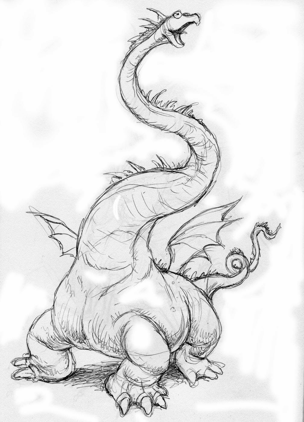
WEIRD DRAGONS

This guy has a snout like a gavail, kind of beaver feet,
and I 'm not sure what animal has little knobs like that.
I attend a writers' critique group most weeks, and I generally spend most of the time listening. When I listen I like to doodle, and what I'm doodling has nothing to do with what I'm listening to. My high school biology teacher was stunned because I would be drawing constantly the whole time he was lecturing, but I was still able to get A's in his class. I mention this because I have a habit of drawing dragons during my writers' meeting, and I don't want people to think I'm not paying attention. Rarely does anyone in the group read a story that has anything to do with dragons, but for some reason that's where my brain goes.

I guess this is pretty typical
Usually my basic dragon prototype is an alligator head, a dinosaur body, iguana spikes, and giant bat wings. But I've been playing around with the form and trying to introduce DNA from some other species (I really was paying attention in biology class).
Different kind of dino body.


I scanned a few and added some color in photoshop.
Aquatic dragon (I don't think he's going to fly very far with those wings).

Maybe a rainbow stork dragon? Definitely from the tropics. The feet remind me of aye-aye hands (except with webbing)


Snapping turtle head. I figure this guy doesn't move to fast, except for his head and neck. And those wings are just for show. Maybe, like a hippo, he sits with most of his body under water and the  heads whips around and catches prey. Maybe the wings swish the fish to where the head can snap them up.


Not quite sure what to say about this guy. Probably good at texting with those fingers.  But why is his head so heavy?

Monday, July 8, 2013

Puppies! Puppies! Puppies!


With July comes the launch of a new chapter book series that I’ve been illustrating entitled Palace Puppies, written by Laura Dower.

Whenever I’m discussing what goes into illustrating a book cover I explain how the cover illustration should engage the reader, how it should convey information about the character and the setting, and most importantly how it should make the reader curious about what is happening inside the book. With Palace Puppies there was one task that superseded all the others; make some really really really really cute puppies.

Another interesting aspect of illustrating these covers was the specific directions I received regarding the color palette (Sunny and the Royal Party was to be a little more pink, Sunny and the Snowy Surprise a little more blue, etc). I didn’t really appreciate the reasoning behind this until I saw all for covers presented as a group, with the varying color trim. I enjoy looking at the 4 books together as a set, it reminds me of a box of puppy marzipan or something.


Creating the text illustrations for Palace Puppies was fun on a number of levels. It was fun to show the regal lifestyle of Annie and James, the princess and prince in the fictitious kingdom of Glitter Rock, and their puppies, Sunny and Rex. The royal family has loved dogs for generations, so wherever possible I tried to incorporate canine elements into the lavish palace décor.


I was allowed to be creative with the placement of the illustrations and how they interacted with the copy. This meant more work for the designer, who sometimes had to bend the shapes of the paragraphs, but I think it makes for an end product that is much more fun to read. I'm really hoping young readers enjoy this fun new series.


Sunday, June 2, 2013

Sweet

I'm am going to start participating in "Illustration Friday" a website where illustrators post work relating to a weekly theme. http://illustrationfriday.com/  This week's theme was "sweet".

Monday, May 27, 2013

A new technique?


For years I’ve been struggling to find a technique that is well suited for illustrations that feature a lot of humorous details. One that maintains the fresh quality of my pencil sketches. I used to use pen and ink and watercolor for these pieces, but, in my hands, these tools did not result in work that I was 100% satisfied with (or even 60%). I envy those who have mastered watercolor. I am not one of them. Yet I love working with it, the way the paper and the liquid interact.

I’ve been experimenting with digital techniques. I thought the answer would be to create work from scratch on the tablet, yet I always found something sterile in the results. Too airbrushy.

So, I think I have stumbled on a technique that resolves the issues I’ve been having with both techniques. I refine my pencil drawing using graphite, water soluable black pencils, sometimes black prismacolors. Then I use grey watercolor (neutral tint) to add value and texture, then I scan into Photoshop, and add color transparently, in different layers, with different opacities.

So, I guess I'm really compartmentalize the process, first line, then value, and finally color. But the good thing about working in layers in Photoshop is that I can always go back and adjust my line, or adjust my value.

Original drawing, value painted with watercolor. 

Final piece, color added digitally.

Thursday, June 2, 2011

Mother Goose Game


A few months ago I received an assignment from Patch Products: Illustrate a Mother Goose Game. A fun project, the only problem was that I had about 15 minutes to create the artwork (I'm kidding, I had a few weeks, but it felt like 15 minutes). A box cover illustration and 12 different scenes from the classic nursery rhymes for the game board. In order to meet the deadline I painted the the art to a certain level of completion, making the cover a priority, and with two days to go I had the work scanned and finished everything in Photoshop. Luckily the designer at Patch patched it all together. Should be in stores soon!

Wednesday, March 16, 2011

Highlights Puzzle Poem Illustration of the Year!


This morning I heard the UPS guy drop something off on my porch. I'm always ordering used books on Amazon, I figured that must be it. I opened the box and. much to my surprise pulled a shiny metal plate engraved Highlights High Five Puzzle Poem Illustration of the Year, John Steven Gurney, "Spider Shoes", 2010. I went back to my front porch to see if any paparazzi were lurking about, but no.

Well, media circus or no, I'm delighted to get any kind of positive recognition. "Spider Shoes" was an illustration I made for Highlights High Five magazine sometimes last year. One of the fun things about it was that it was one of the first true oil paint/photoshop hybrid. I like the way the oil painted underpainting texture carried through to the finished illustration.

Tuesday, January 11, 2011

This guy has no sense of scale!


It's always a challenge to decide which pieces to feature in your portfolio. I was proud of this illustration. When I'm working in this style I aspire to be a second rate Norman Rockwell, but I was really pleased with how the characters came out in this piece. I featured it on my website, I put it on a promo card.
After it was circulating for years I had two different people tell me they didn't think I had a grasp of human proportion, that the man is too big in relation to the kids. Well, duh, I thought, he's A GIANT! The book is Giants Don't Go Snowboarding! But, when I display the piece I usually show it without the type, so how would anybody know that? Another problem is that he is just a little bit bigger than is probably possible. Since its a Bailey School Kids Book, one of the underlying premises is that this character might possibly be an oversized human rather than a giant, so I can't go too extreme.

So, if I had made him 20 feet tall, people would have known he's obviously a giant, if he was 7 feet tall, they would think he's a large human. As it is, I look like I have no sense of scale!

Tuesday, December 7, 2010

High Five illustration Sky Transplant


I recently painted a cover illustration for Highlights for Children's High Five Magazine (May 2011 issue). The illustration featured kangaroos jumping rope, while a bunch of jumping mice engage in parallel play. I finished the oil painting, and I was about to take it to my photographer to convert it into a digital file, I noticed the sky on an old "Big Apple Barn" illustration of mine. I felt like I was lazy on the sky I painted for the kangaroos, so I had the Big Apple Barn illustration shot too, then I did a "sky transplant" in photoshop.

Monday, December 6, 2010

Attempting to post an illustration.

I did this illustration as a sample piece. It's been a long time since I got any humor/fantasy assignments, so I thought it would be a fun scene to illustrate. What exactly is going on? The dwarf on his flying scooter is trying to get away with that confused weasel, and the boys on that dragon have been searching for him. Someone commented that the dragon's wings aren't big enough to carry his weight, but I image the dragon's belly is filled with some sort of gas that keeps him buoyant, like a hot air ballon, and the wings are just kind of for directional purposes.